You're standing in the driveway with three vinyl siding samples that looked nearly identical under showroom lights. Once the boards are on the house, one reads flat against the roofline, another clashes with the front door, and the third makes the brick next door look dull. That's how a reasonable color choice turns into an expensive lesson in outdoor light.
The right color scheme for vinyl siding has to work as a complete exterior system. The primary siding color, trim, shutters, entry door, roof, windows, masonry, landscaping, and neighboring homes all affect the final result. These eight pairings are practical starting points for Columbus homeowners. Each one includes the accent logic, architectural styles where it performs best, and how it tends to read from the street.
For broader curb appeal tips for homeowners, start with the fixed parts of your exterior before choosing a siding sample.
Table of Contents
- 1. Classic White and Charcoal Gray Two-Tone
- 2. Warm Beige and Dark Brown Earthy Palette
- 3. Sage Green and Cream Cottage Style
- 4. Soft Gray and Slate Blue Modern Minimalist
- 5. Warm Taupe and Burgundy Sophisticated Traditional
- 6. Crisp White and Black Contemporary Contrast
- 7. Soft Greige and Pale Bronze Transitional Blend
- 8. Pale Yellow and Deep Forest Green Heritage Charm
- 8 Vinyl Siding Color Scheme Comparison
- Choosing Your Palette With Confidence
1. Classic White and Charcoal Gray Two-Tone
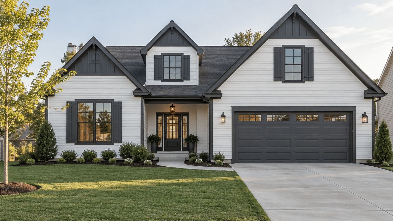
Crisp white siding gives this palette its traditional foundation. Charcoal gray adds weight around shutters, gable ends, fascia, selected trim, and the front door. The contrast is clear from the street, but the combination still feels established rather than tied to a short-lived trend.
This pairing suits Colonial homes with traditional shutters, modern farmhouses with gray metal roofing, and Cape Cod residences in suburban Columbus developments. It also works well when the roof, gutters, and window frames already contain dark gray or black tones.
Keep the contrast controlled
A roughly 70/30 balance keeps white as the dominant field color while giving charcoal enough presence to define the architecture. Covering every trim surface in dark gray can make a modest home look visually busy. Use the darker shade where it helps the house read clearly, such as the entry, shutters, porch posts, and gable.
North-facing walls often receive less direct sun, so a darker accent can read especially deep there. Review the full exterior rather than choosing a shade from a single front elevation. Coordinate the charcoal with the roof material, garage door, hardware, and gutters. Black or dark bronze hardware usually completes the scheme without introducing another competing color.
Practical rule: Let the white siding carry the street view. Use charcoal to frame the roofline, windows, and entrance.
White siding can also make maintenance marks more visible near planting beds and downspouts. Before installation, compare the proposed color with your roof and inspect available product-care guidance in HIBCO ROOF LLC's vinyl siding care guide.
2. Warm Beige and Dark Brown Earthy Palette
Warm beige siding gives a Columbus home a softer street presence than bright white. Dark brown or espresso accents on shutters, fascia, doors, and selected trim add definition without the sharper contrast of black. The result feels grounded beside lawns, mature trees, stone foundations, and wood details.
This palette is a natural fit for ranch homes with stone foundations, cottage-style residences with mixed materials, and transitional houses that combine traditional proportions with updated details. It also works well on homes where the roof contains brown, tan, or warm charcoal granules.
Make the undertones work
Choose beige with a neutral or gently warm base. Yellow-heavy beige can look dated beside gray windows or cool masonry. Place a sample against the foundation stone and roof, then view it in both morning and afternoon light. Outdoor light can pull a beige toward yellow, gray, or pink in ways that indoor samples don't reveal.
Dark brown works best as a supporting color. Use it on the front door, shutters, fascia, and perhaps the garage door if the architecture can carry the weight. Natural stone, cedar-style accents, or a wood-tone entry can reinforce the palette, but don't add every warm material at once. The siding should remain the main visual surface.
A medium-toned roof usually keeps this combination balanced. A very dark roof with espresso trim can make a low ranch appear heavy, especially where the house has limited daylight or deep overhangs.
From the street, this scheme feels welcoming rather than formal. It's a good choice when you want the siding to sit comfortably among surrounding homes instead of creating a high-contrast focal point.
3. Sage Green and Cream Cottage Style
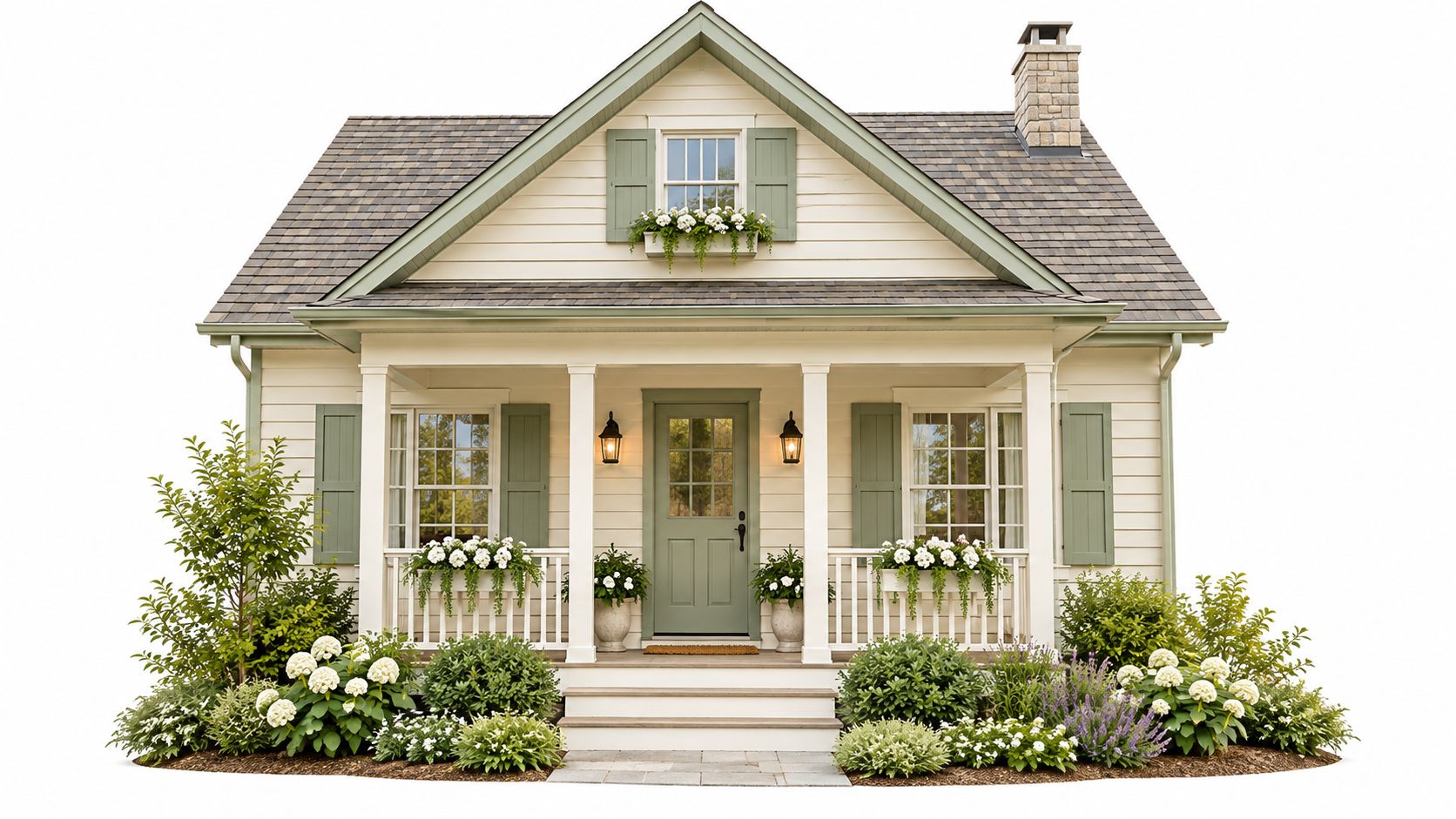
Cream siding and muted sage green accents create a cottage exterior with enough structure for modern suburban architecture. Use cream across the main walls, then bring sage into shutters, the front door, selected trim, and perhaps a porch gable. The colors feel connected to landscaping without disappearing into it.
This pairing suits modern farmhouses with traditional roots, cottage-inspired homes in established neighborhoods, and properties with mature trees or substantial planting beds. It's particularly effective when the home already has a light gray roof, natural wood, or stone near the entrance.
Use sage as an architectural accent
The green should be soft and restrained. Bright green looks playful in a way that can overwhelm a full exterior, while olive can pull the palette toward a heavier, more rustic direction. A muted sage gives the house personality without making the color the only thing people notice.
Warm cream is important. A cool ivory beside blue-gray roofing can make the green look disconnected. Compare the cream siding, sage accent, roof sample, and window frames together. If the front door is the main sage element, repeat the color on shutters or a gable so it doesn't appear accidental.
Landscaping should support the exterior rather than compete with it. Keep foundation planting organized, especially around a green entry door. Overgrown shrubs can hide the contrast that makes this scheme work from the street.
Sage and cream are forgiving beside many existing materials, but they still need testing. A sample that looks soft in shade may read much lighter in direct sun. View it on the front wall and on a side elevation before making the final choice.
4. Soft Gray and Slate Blue Modern Minimalist
Light gray siding gives this scheme a quiet base. Slate blue or muted navy then concentrates attention on the entry door, selected shutters, and carefully chosen trim. The colors create variation without relying on excessive ornament or multiple siding profiles.
This combination performs best on modern farmhouses with metal roofing, contemporary homes with large windows, and updated mid-century modern residences. Clean lines help the palette stay intentional. On a house with many competing decorative details, the blue may look scattered instead of architectural.
Let the blue do less
Choose a gray with a slight warm undertone if the home has wood, beige masonry, or a warm roof. A cold gray beside warm materials can make the exterior feel disconnected. The slate blue should look softened and refined, not like a saturated navy accent pasted onto a neutral house.
Use blue primarily at the entry and on select shutters. Repeating it across every trim surface removes the hierarchy that makes the palette effective. Warm wood at the porch, garage door, or entry can keep the gray and blue from feeling too cold. Stone can do the same when it contains tan or muted brown notes.
Matte or low-sheen finishes generally support the restrained character of this design. Coordinate the blue with architectural shingles, composite materials, or metal roofing rather than trying to match the roof exactly.
From the road, this palette reads clean and current. It works especially well where large windows, simple rooflines, and limited trim provide enough visual structure for two quiet colors to make an impact.
5. Warm Taupe and Burgundy Sophisticated Traditional
Warm taupe or greige siding provides a calm, substantial field color. Burgundy or wine-toned accents bring depth to shutters, the entry door, and selected trim. The combination has traditional character, but it doesn't need to look old-fashioned when the burgundy is used with restraint.
This scheme suits symmetrical Colonial homes, brick-and-vinyl exteriors with substantial character, and established Columbus neighborhoods with mature properties. It also gives a partially brick home a practical way to connect the siding to warm masonry without attempting an exact brick match.
Reserve burgundy for focal points
Burgundy is strongest at the front door and shutters. Covering fascia, corner posts, garage doors, and every trim surface in the same dark red can make the exterior feel compressed. Warm taupe should remain the dominant surface, with cream or ivory trim separating it from the deeper accent.
The taupe needs warm undertones. A cool gray-taupe can make burgundy appear purple, especially in shade. Compare the siding beside the brick, mortar, roof, and window frames. If the home has brown or rust-colored roofing, burgundy may connect naturally. If the roof is cool slate, test the pairing carefully before ordering.
Classic architectural shingles provide an easy roof match. Warm bronze or copper-toned hardware and gutters can reinforce the traditional direction. Black hardware can work too, but it introduces a sharper note and should be repeated consistently.
Burgundy should guide the eye to the entrance and windows. It shouldn't become the entire exterior's background noise.
From the street, taupe and burgundy feel confident and settled. The palette has enough distinction for a replacement project, yet it remains compatible with older neighboring homes and traditional landscaping.
6. Crisp White and Black Contemporary Contrast
Pure white siding and black or near-black accents produce the strongest contrast in this list. White keeps the wall surfaces bright, while black defines fascia, shutters, doors, trim, and major architectural breaks. The result is especially effective when the house has clean geometry.
This palette suits modern farmhouse designs, contemporary homes with metal roofing, and transitional architecture with minimalist details. It can also sharpen a plain exterior, but only when the black is placed around meaningful features rather than scattered across small accessories.
Use black selectively
A black front door creates a clear focal point. Black shutters can reinforce traditional windows, while black fascia and gutters can make the roofline look deliberate. Applying black to every available surface may make the home look smaller and heavier, particularly under a dark roof or in a shaded yard.
The white should be crisp if maximum contrast is the goal. Off-white or yellowed white changes the relationship and may soften the design in an unintended way. Review the siding beside the roof, window frames, garage door, and masonry. White siding can make warm brick look more pronounced, so don't assess the color without the existing facade.
A light or medium-toned roof usually prevents the composition from becoming top-heavy. Matte black hardware supports the contemporary look without adding shine. If the home has warm wood at the porch or entry, keep that material visible. It can stop the black-and-white combination from feeling stark.
This is one of the most recognizable color schemes for vinyl siding from the street. It works when the surrounding neighborhood can absorb a bolder contrast, but a softer white and charcoal version may fit better where homes sit close together.
7. Soft Greige and Pale Bronze Transitional Blend
Greige siding bridges gray and beige, which makes it useful on homes that sit between traditional and contemporary design. Pale bronze or warm tan accents add quiet warmth around the front door, shutters, and selected architectural details. The palette looks refined without depending on a dramatic contrast.
It suits transitional homes that blend farmhouse and contemporary elements, new construction in established neighborhoods, and properties where the owners want neutral sophistication. Greige can coordinate with tan, gray, or pewter-toned roofing, but the exact undertone matters more than the color name.
Test greige by manufacturer
Greige varies substantially from one product line to another. Request physical samples from the manufacturer you're considering, then view them beside the roof, windows, garage door, and permanent masonry. A shade that looks balanced online can read gray in the shade and beige in afternoon sun.
Pale bronze works best in controlled doses. Use it on the entry door or a limited trim area, then bring in wood elements if the exterior needs more warmth. Cream or ivory accents can keep the gray component from taking over. Avoid combining pale bronze with too many brown accessories, or the palette may lose its transitional clarity.
A greige exterior should look related to both the roof and the landscape. If it looks neutral only in a showroom, keep testing.
This scheme has broad flexibility from the street. It can look polished on a newer development home without appearing out of place beside older properties. The main risk is visual flatness, so use the entry, roofline, and wood or stone details to create depth.
Before budgeting for the project, review how the selected siding profile and related work affect the scope in HIBCO ROOF LLC's vinyl siding replacement cost guide.
8. Pale Yellow and Deep Forest Green Heritage Charm
Soft pale yellow siding gives this palette its welcoming character. Deep forest green on shutters, the front door, and selected trim grounds the color and connects the exterior to trees and traditional landscaping. The result feels personable without relying on bright, high-energy colors.
This pairing works well on farmhouse-style homes with traditional shutters, country residences with mature trees, and properties with heritage or historic character elements. It can also bring warmth to a simple two-story home when the porch, roofline, and window arrangement already support a traditional reading.
Keep the yellow quiet
Choose a butter-toned yellow with warm undertones, not a saturated golden shade. Bright yellow can dominate the street view and compete with the roof or masonry. Forest green should look natural and deep rather than artificial or neon.
Traditional white trim can clarify the windows, porch posts, and roofline. Use the green on all shutters and the front door when the house has symmetrical features. Repetition makes the accents feel planned. Natural wood roofing details, asphalt shingles, bronze hardware, or black hardware can all work, depending on the existing exterior.
Landscaping matters more with this scheme than with a neutral gray palette. Dense or poorly maintained planting can make the yellow disappear, while structured greenery can frame the green accents and reinforce the heritage character.
From the street, pale yellow and forest green feel warm and distinctive. They're a strong fit for homeowners who want more personality than beige or white but still want the exterior to feel connected to established Columbus neighborhoods.
8 Vinyl Siding Color Scheme Comparison
| Style | 🔄 Implementation complexity | ⚡ Resource requirements | ⭐ Expected outcomes | 📊 Ideal use cases | 💡 Key advantages |
|---|---|---|---|---|---|
| Classic White and Charcoal Gray Two-Tone | Moderate, needs balanced proportions (≈70/30) and attention to dirt | Low–Medium, standard vinyl/paint; more frequent cleaning of white | High, timeless, sophisticated curb appeal | Traditional, colonial, farmhouse; resale-focused neighborhoods | Universally appealing; easy coordination with roofs; use darker gray on north faces |
| Warm Beige and Dark Brown Earthy Palette | Low, forgiving application but avoid overly warm undertones | Low, pairs well with stone/wood; hides dust/weathering | Medium–High, warm, welcoming appearance that ages well | Ranch, cottage, wooded or rural properties | Ages gracefully; complements mixed materials; choose neutral beige samples |
| Sage Green and Cream Cottage Style | Moderate, requires color matching and landscape upkeep | Medium, may need coordinated trims and garden maintenance | High, subtle personality and curated, cottage charm | Cottage, modern farmhouse, homes with mature landscaping | Distinctive yet understated; pick muted sage and maintain gardens |
| Soft Gray and Slate Blue Modern Minimalist | Moderate–High, careful coordination to avoid cold or discordant tones | Medium, modern materials (metal roofing) and precise samples | High, contemporary, refined aesthetic with subtle color layering | Modern/minimalist, mid-century, clean-lined contemporary homes | Timeless modern appeal; select warm-leaning gray and slate blue accents |
| Warm Taupe and Burgundy Sophisticated Traditional | High, confident, strategic use of burgundy required | Medium, classic materials, warm metal accents recommended | High, upscale, refined appearance that suggests quality | Traditional colonial, brick/mixed-material homes, established neighborhoods | Enhances perceived value; use burgundy sparingly (doors/shutters) and warm taupe |
| Crisp White and Black Contemporary Contrast | Moderate, strong visual impact but needs careful balance and maintenance | Medium–High, white shows dirt; black absorbs heat; durable finishes advised | Very High, dramatic, memorable curb presence with sharp definition | Modern farmhouse, contemporary minimalist, design-forward properties | Extremely distinctive; use pure white and selective matte black for focal points |
| Soft Greige and Pale Bronze Transitional Blend | Low–Moderate, subtle selections critical to avoid washed‑out look | Medium, request multiple samples; versatile with many materials | High, adaptable, broadly appealing neutral sophistication | Transitional homes, new construction, buyers seeking neutral elegance | Highly adaptable; greige hides dirt while bronze adds warmth, test samples in light |
| Pale Yellow and Deep Forest Green Heritage Charm | Moderate, undertone selection and landscape support influence success | Medium, may require upkeep of paint and complementary landscaping | High, warm, personable, heritage-rich curb appeal | Farmhouse, country properties, homes on larger lots or historic contexts | Distinctive and welcoming; choose warm pale yellow and natural forest green, pair with white trim |
Choosing Your Palette With Confidence
Start by narrowing the list to two or three pairings that fit your roof color, architectural style, and landscaping. The roof is usually one of the largest fixed surfaces, so the siding doesn't need to match it exactly. It does need to relate to the roof's undertone and visual weight.
Your existing brick, stone, windows, gutters, garage door, porch, and entry door also limit the practical choices. A warm beige may sit comfortably beside brown masonry, while a blue-gray can work better with slate roofing and cooler window frames. If you're keeping those materials, place the siding samples directly beside them instead of judging each color alone.
Recent homeowner preference data supports starting with a neutral base. A 2025 survey of more than 1,300 American homeowners found that off-white or cream was preferred by 18% of respondents planning an exterior update, followed by white at 16%, light brown at 13%, light gray at 11%, and medium blue at 8% [according to Builder]. Those figures are U.S.-based, not Columbus-specific, but they support presenting cream, warm white, taupe, and light gray before stronger accent colors.
A separate 2026 U.S. Houzz Outdoor Trends Study surveyed 1,191 homeowners who had recently completed, were undertaking, or planned an exterior upgrade. Beige represented 24% of selected exterior wall colors, compared with 14% for white, 12% for gray, 9% for green, 8% for black, and 7% for brown. The same study reported that 69% selected contrasting wall and trim colors, which supports treating the exterior as a coordinated system rather than one uniform siding color [as reported by ABC 17 News].
Evaluate color performance, not just appearance
Dark siding deserves a wall-by-wall review. South- and west-facing elevations can receive strong summer sun, and concentrated reflections from energy-efficient windows may create distortion on light or dark vinyl siding. Look at roof overhangs, nearby trees, screens, ventilation, and reflective windows before deciding that a dark color is either safe or unsuitable.
Color-retention documentation also matters. ASTM guidance on vinyl siding color and appearance describes ASTM D7856, which uses the CIE 1976 Lab* color space and two-year outdoor weathering to evaluate color retention. ASTM D7793-24 reports a maximum total color difference of ΔE 1.5, with chromatic-coordinate limits of ΔaH 1.0 and ΔbH 1.0 between a production specimen and its reference or agreed color coordinates. Ask for the applicable standard, certification status, and warranty limitations for the exact product and color.
Vinyl siding colors have changed considerably since the material's commercial introduction in the late 1950s. Early products generally stayed within white and pale tints because darker pigments were more vulnerable to unacceptable fading. Later acrylic capstock technology supported deeper shades such as barn red, forest green, ocean blue, and custom colors. By 2009, one major manufacturer reportedly offered more than 700 hues, while darker siding carried an estimated premium of approximately 30% over conventional pale-colored PVC capstocks. The Vinyl Siding Institute expanded its certification program in 2006 to include color retention, with approximately 350 shades listed under that program at the time of reporting [as described in Houzz]. The same industry source estimated vinyl siding's service life at around 30 years and reported that vinyl represented roughly one-third of residential siding sales. Treat those figures as context, not a substitute for the current product warranty.
Order the right samples
Order full-size sample boards when possible. View them in morning and afternoon light, on the front, south, west, and shaded elevations. Stand back far enough to see the whole roofline, then move close enough to compare the siding against windows, masonry, trim, and the entry door.
A digital visualization helps compare combinations before materials are ordered. It can't replace physical samples because screens, cameras, shadows, and display settings alter color. Use the visualization to reduce the list, then make the final decision outdoors.
If you're planning a siding replacement, HIBCO ROOF LLC is a licensed and insured exterior contractor serving Columbus and central Ohio. The company offers vinyl siding replacement, roof design visualizations for comparing styles and colors, and free written estimates. For additional perspective on how painted and factory-finished exteriors differ, review expert advice from I PAINT STUFF.
Choose the palette that works with the house you own, not the house shown in a showroom rendering. Order the samples, test each elevation, compare the roof and neighbors, and confirm the product's color-retention requirements before signing off.
HIBCO ROOF LLC can help Columbus and central Ohio homeowners compare vinyl siding colors with the roof, trim, windows, and other exterior materials already on the home. Request a free written estimate and use the company's siding replacement and roof visualization services by visiting HIBCO ROOF LLC.